Thursday, October 14, 2021

 Project B Part 2


    I have designed several concept images to represent different user interfaces (UI) I propose to have in my game concept.  The first UI, seen below, displays a game loading screen.  The loading screen is usually very aesthetic to the user.  This is not my final idea for a game logo image but temporarily I used the image of a shark.  The box to the right of the screen will display game and company updates.  This is a place for any announcements to be posted by the developers to keep the gaming community notified.  All the text seen on the left side of the screen will be push button links to take you to that screen labeled.  Each button is labeled in simple and plane language.  I tried to keep things as simple as possible so players could navigate to where they wanted to go without confusion.  


    Next, I needed a playable UI to operate during actual gameplay.  I wanted something simple and almost self explanatory.  I also wanted the UI out of the way of the user so they wouldn't get distracted by it.  I think it's a lot better for user to see icon images that represent items in game than trying to read anything while the game is in motion.  This approach is the 4th wall where the user is looking in one side of the box to present first person.  This type of UI creates a better immersion for the user while playing.  Here I used a red bubble to represent the life force of the player.  When the player gets injured the bubble leaks blood.  Once the bubble is empty, the player is dead and has to respawn.  The bar at the bottom of the screen will hold six different items the user choses to place there.  This is a quick select bar where players can use numbers 1 through 6 to quickly select the item in that space.  Again, this is just a rough sketch of the final concept to be created.  The bar at the top left represents experience gained.  Each time the bar fills to the end, the player advances 1 level.  The icons vertical on the right side will only appear when the player is affected by a condition.  One will show is the player is hungry or if the player is being shocked in the water.  This idea would be described as Non-Diegtic.  


 The next UI I needed was an inventory display.  One that would show the players inventory and the containers inventory at the same time.  If a player was to look into a storage box.  The player would have to see both inventories in order to drag and drop items of their choice to and from each inventory.  I designed this UI to show the players inventory on the left side of the screen while showing the containers on the right side.  The middle area is used to display the players attributes and distribution of individual attribute strength.  The player can click on the tab at the top of the attribute box to see the attributes of a structure.  The top of the inventory boxes have selectable tabs to switch to a crafting UI if player wishes.  These tabs are familiar to most computer users because they exist in all internet explorers.  The six boxes across the top of the screen will allow the user to switch between different UI screen for different functions.  Everything will be slightly transparent incase an enemy approaches while you looking in a container.  This style of UI is called Meta.


    The nest order of business was to create a UI concept where one interactive item had several choices for a user to pick from.  I created this UI in a rotary design where a user would click on the item and rotate around a wheel to land on their decision.  The example I used was a sleeping pod, in this case a bubble the user gets in and sleeps in.  The bubble can also be used to teleport the player to other bubbles they left around the map.  In addition, the player has a choice to rename the bubble and even click on destroy the bubble.  Again, I left the concept transparent so not to take the eyes off danger.  


Lastly, I need a crafting UI.  As players gain experience and level up, they receive tier point to unlock new crafting items.  The large numbers represent levels the player must reach before being allowed to unlock those items.  More items present the higher the players level.  Each box will have a cost in tier points so players must chose between the selection on what they want to unlock.  I added a search because there will be 100 levels to a player and once the player has hundreds of craft able items to review, they can find them quickly buy alphabetical search.  


Wednesday, October 6, 2021

 Project B Part 1


    For project B, I want to create a user interface (UI) for my underwater game concept from project A.  This game will be played in first person perspective so I want a UI the player can see through the "forth wall".  The UI needs to display basic survival game elements.  I want to display the players amount of life force left before their character dies.  I thought about displaying this in the form of a geometric sphere to represent a bubble of blood.  The blood will leak out as the player receives damage.  There will be a bar of some sort across the top or bottom of the screen to represent a total of player experience.  As the player gains experiences in the game the bar will develop in some fashion to indicate the player progression in leveling their character.  The player will have six visible hotkey spots to hold different items.  These items will be selected and placed inside empty open boxes lined up at the bottom of the screen.  There will be a display vertical icons showing environmental condition affecting the player.  Here I will show temperature and water condition.  Other elements will appear here and disappear here.  Things like poison in the air and hazardous materials in the water.  I may have other animated images appear in this UI when different things happen to the character during gameplay.  I want to keep this UI in the playable area as simple as possible so not to confuse the player when things are happening in the game.  

    Other UI displays will have to be created to show crafting explanations and inventory displays.  There will also have to be a UI display for tamed creatures and structure inventory.  Plus, UI to operate the abilities of those structures.  I think for the inventory UI, when looking into an object, I will have a pop-up display that covers the screen for the user.  I may make this slightly transparent for the user in case they are attacked during this time.  I figured, in real life, when you're looking in something like a container, you're distracted too.  I may make it possible for users to toggle certain UI components on and off with hotkeys.   

    Through my research of this subject, I have discovered there are four different user interface types in games.  

The first type is called Non-Diegtic:

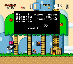
    This type of interface is not in the story space.  Characters are not aware of what's showing.  These objects exist on a different layer than the game world platform.  A good example of this type would be scores and numbers tallied at the top of the screen for many games. Here is an images of the popular game Mario by Nintendo showing this type of UI along the top of the screen.  


The second type is called Diegtic:

This type of UI is in the story and in the space.  Usually a user can see an object in the gameplay and once that object comes into contact with the user character, there is some effect to the character.  In the game Mario, object drop or float, Mario can catch these objects changing the players abilities or appearance.  Below is an image to represent this type of UI.


The third type is called Spatial:

This type of UI is not part of the story but shows up in the playable space of the character.  An example of this in Mario is when the character jumps on an enemy or bumps an object.  You often see additions or numbers appear above the object which the character can't actually interact with but it's show for the users information.  An image below show this type of UI.


The fourth and last type of UI is called Meta:

This type of UI is in the story or progresses the users advancement with-in a story.  It sometimes reveals progression in the story development.  This UI is not actually in the story but scene by the user.  in Mario you see this often as you finish maps.  It gives information to the next level of events.  Here is an image to give the example of Meta UI.


Based on this research and different types of UI displays that exist I want to incorporate several of these into my game concept.  I definitely want to create a third wall based on the forth dimension.  A place where the user sees the unseen and can orchestrate the advancements throughout the game.  

 Project B Part 3


Thursday, September 16, 2021

Project A: Part1

     These images are explained in more detail on the original portfolio page linked in unit 1.  Here is a collection of images I selected ad inspiration to develop my character and environmental concepts.

Wednesday, September 15, 2021

Project A: Part 2 

       I first started my concept for this under water world with my main character controlled by the player. Originally, I was inspired by images of "The Creature From The Black Lagoon" and fish people seen in movies like Aquaman. As I started to sketch out the character, you can see it started to change a bit. I had two thoughts when creating it. I wanted it to look more like an evolve human into the future than just being a fish man. Also, I thought that too many fins and lines and details would be more difficult to replicate for an animator or game design artist. Having these thoughts in mind, I simplified the character a bit. I went future in my concept illustrations to show details in the faces and some of the different features which could be varied by the game user. I sketched out a face with masculine features and one with more feminine features. I showed my concept for the human webbed hands in feet of the main characters. I sketched out a few recognized sea creatures and one mythological Meglodon. I also added an environmental concept drawing to give a perspective on atmospheric perspective in this open world underwater game. I want there to be many canyons and caves to explore in the game. Lots of places creatures can hide and players may approach them without relizing it. It's going to be interesting to compose all these elements together for the final presentation.

Tuesday, September 14, 2021

Project A: Part 3 

     Suggestions in my discussion forum for Part 2 suggested looking at movie posters of JAWS before starting my final concept image. While looking up movie posters, I also ran into Jurassic World. On this poster it shows a Mosasaur with its mouth open, getting ready to swallow a great white shark. I thought the image was really cool and fit my theme. I went into Photoshop and layered zoomed in images of sharks mouths open. I then went in and place an underwater images with high transparency over that image to blur my shark a bit and make it appear further in the depth. I superimposed generic divers over the overlay and hand drew directly over each image. I drew feature of the characters from my character concept images. I left a bit of negative apace so I wouldn't crowd the composition. I wanted it to have the feeling you were underwater with infinite amounts of space. I decided on a title for the game. It became "Tomorrow", The Year 5051. This was the for line in my concept narrative idea. I tried to create a balance in my composition. I feel like the viewer focuses on the more defined character in the upper left than your eyes move to the right. The round shapes in the sharks jaw bring the viewers eyes back around to the characters at the bottom of the composition and back up. My color scheme remained a analogous palette of blues and greens. I didn't want a lot of high saturated contrast or competing complementary elements distracting the viewer. 

 Here's Project A Part 3. Let me know what you think.